As announced in EagleEye on April 10, we’ve made a huge change to how the UMW site is viewed on mobile devices. Here we’ll talk about the differences and decision making that went into this rollout.

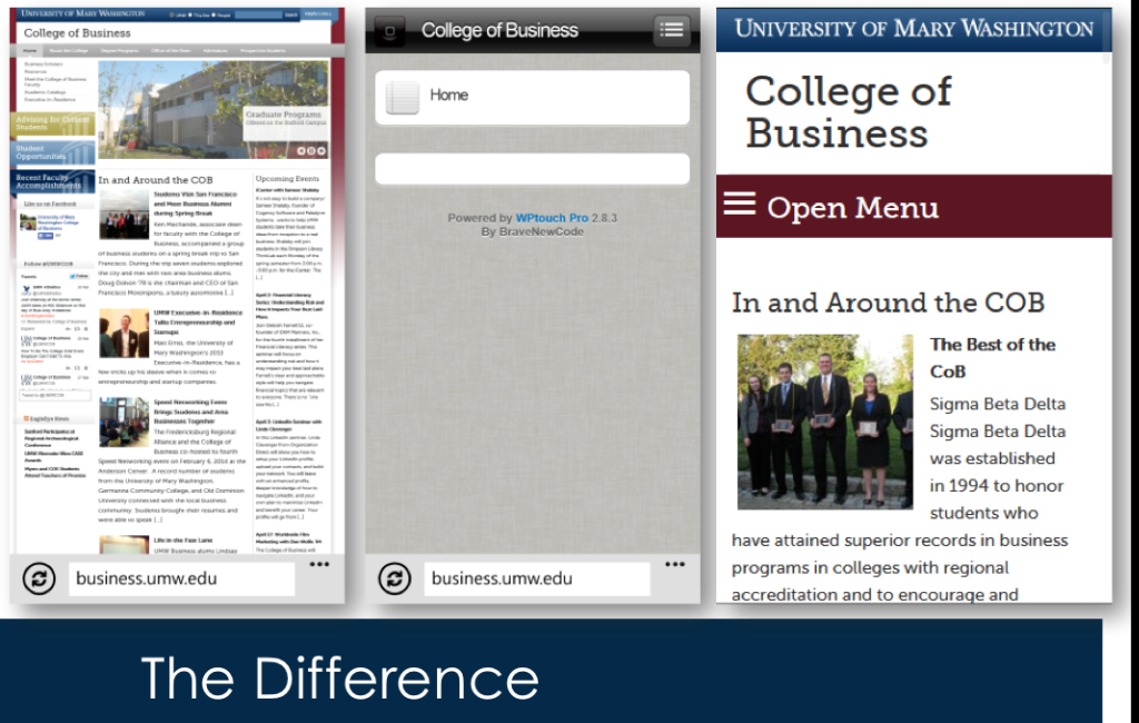
This display shows the College of Business homepage on a computer, using the old mobile interface, and with the new mobile responsive theme. One of the major problems with the old mobile interface was the site layout had to be configured very specifically to get the components to display in the mobile view at all. With content managers making changes all the time, we couldn’t guarantee their changes wouldn’t break the mobile view. The new mobile responsive theme uses existing content regardless of changes content managers make to the site.

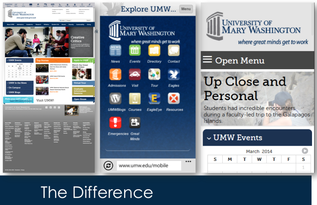
Here’s the University homepage on a computer, on the old mobile interface, and on the new mobile responsive theme. The old mobile interface provided icons of the top things we thought users would want to be able to do, but it made it almost impossible to break out of that pre-determined list and find other content on the site. The new mobile responsive theme provides all of the tools currently available on the website in an easy-to-use format.
One key issue with the old mobile interface was that it made collecting user behavior data unreliable at best. Our users spent so much time trying to get past those screens, to break free from the interface, that we can’t really be sure of what they were trying to do or how long it was taking them to do it. Moving to a responsive design means we can start to really understand user behaviors and adjust to meet their needs.

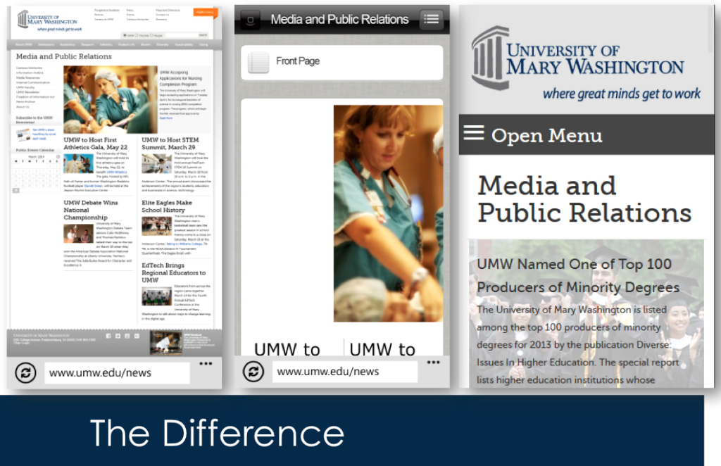
Another example of the old mobile interface being less than user friendly. When you got content to display, some content blocks didn’t work as well as they should have, leading to a frustrating user experience. The new mobile responsive theme helps provide the same info in a manageable format regardless of the mobile device. We call this device agnostic.
Oh yeah, we also removed helpful links and brought the toolbar out into the open.
Benefits:
- Faster, leaner – shaved 1 second of load time and 100 lines of code.
- Accessibility improvements – removing barriers to use.
- Remove a significant pain point for users – improve satisfaction.
- Gain more substantive mobile user data. Behaviors, not just technology trends.
- Foundation for iterative change.
This rollout implemented changes to the fundamental structure of the theme we’re currently using throughout the UMW site. It improved accessibility and gave us flexibility to continue on a continuous improvement path while gathering much needed data about what types of users are doing what types of things on the site and with what technology. We can now start comparing outcomes between iterations and measuring success. The process of using data and user testing to monitor the success of iterative change will lead us toward establishing specific outcomes for redevelopments and feature decisions. In short, this is a Very Big Deal.