Below you’ll find some of the most important qualities of a branded web page, based on the UMW brand standards, legal requirements, and web best practices. While colors, fonts, and logos are important, they’re not “the brand” — they’re part of a larger picture that also encompasses functionality, messaging, writing, and more. This list is not exhaustive, but offers some helpful guidelines.
Overall
- Does not include any text/information that is out of date (e.g. announcements of past events as upcoming, staff who’ve left, inaccuracies).
- Does not include broken links or spelling errors.
- Makes it clear what part of the University the page represents, and includes easy-to-find contact information for the content provider at the bottom of the page.
- Is consistent with other UMW web sites, both visually and with regard to published content
- Includes introductory text that helps to orient a user/describe what the page is for, and what one will find there — before any large photos/artwork content.
Navigation
- Uses a single, simple vertical navigation block on the left side of each page.
- Includes a navigation block of (ideally) no more than 9 items. (If University of Michigan and Amazon can do it, we can too!)
- Uses link words in navigation that are easy to understand for new visitors, and that are consistent with other UMW units, except when impractical.
- Presents navigation links ordered by need, not alpha.
- Links to content from multiple parts of your site, if it would make sense to the user (e.g. link to a faculty listing from a “people” page and an “about” page)
- Relies on content-based, rather than audience-based navigation. Includes a means to get to any other page on the web site without having to search.
Visual
- Uses only brand standard fonts and colors (with approved exceptions).
- Uses few large, compelling, meaningful, images with clear descriptions/context.
- Should not include custom design elements (buttons, callout boxes) that don’t meet UMW’s visual standards for colors, fonts, sizes, copy quality, etc.
- Does not feel “cluttered”.
- Avoids collages or collections of postage-stamp images.
- Uses white space, artwork, and section blocking effectively (pages should not be completely filled with “wall of text” content).
- Uses any given photograph only once on a page.
- Should not include distracting animations or items that move without a user’s intervention (image slideshows are an exception). — also Accessibility, below
Accessibility/Usability
- Never uses the syntax “click here” or “here” — link text must be descriptive.
- Includes alternative text for every image.
- Should provide an equivalent experience for all users on all browsers, including people with disabilities and people using mobile devices. (i.e. all meaningful content and navigation is available to all users on all types of user agents.)
- Adheres to correct document structure.
Content
- Is written in a user-focused branded voice.
- Has articulated goals and a primary audience in mind.
- Is consistent in both look and type/quality of content with other UMW web sites (e.g. departments/colleges have similar navigation)
- Does not have a “letter from a person” as the content of the home page.
- Reflects best practices of web content strategy.
- Above all, conveys a clear, concise, accessible, usable message and experience.
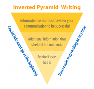 How is writing for the web different from academic writing?